The Persistence of Captioning: Caption This! as Emblem and Art
The Persistence of Captioning: Caption This! as Emblem and Art by Scott Walters
“I delight in photographs
I delight in words
I delight in mixing both
To see what happens if they blend”
Margaret Bourke-White (Hunter, 47)<ref>Hunter, Jefferson. Image and Word: The Interaction of Twentieth-Century Photographs and Texts. Harvard University Press, Cambridge, MA, 1987.</ref>
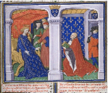
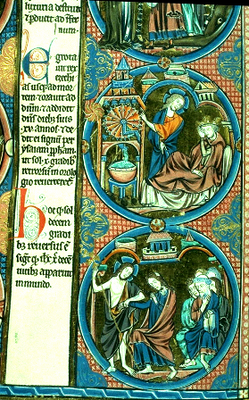
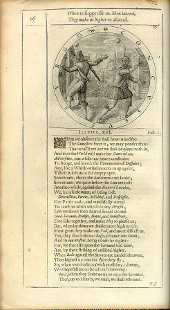
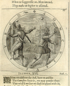
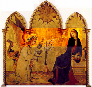
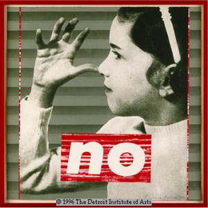
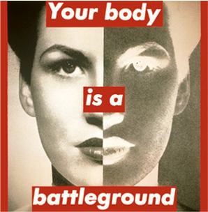
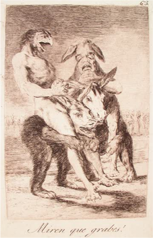
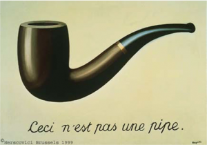
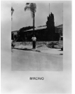
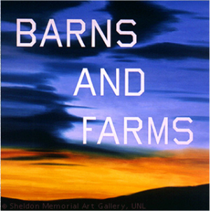
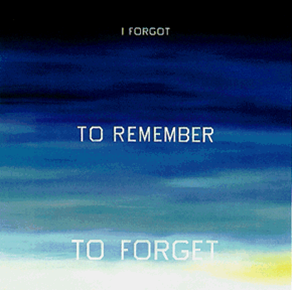
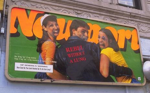
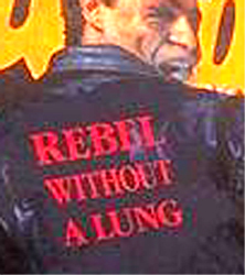
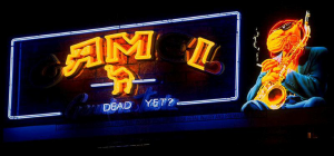
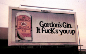
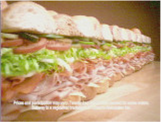
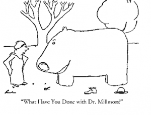
The captioned image is the pop culture playground of participants in the interactive website Caption This!. Users of the site submit captions to static images, or “screengrabs”, frozen from a live cable television feed at the moment a user logs onto the site; the captioned images then appear in a caption “gallery” displaying the 12 most recent submissions, updating each time a new caption is submitted. Participants in the site are loyal, some would say addicted, and there is high respect among captioners for the art of captioning. When a caption succeeds, seems to instantaneously capture the essence of the image, exploiting its semantic possibilities or exploding them, with resulting hilarity, the other participants delight in the captioner’s success. But, to borrow a phrase from a friend who looked at a first draft of this paper, and who in turn borrowed the phrase from Peggy Lee, “Is that all there is?” It that all there is to Caption This!? I don’t think so. To appreciate the power and pleasure of Caption This!, it is helpful to look at the site in the context of other image/text combinations. Such combinations are the most common 20th century images (Elkins, 234)<ref>Elkins, James. The Domain of the Image. Cornell University Press, Ithaca, NY, 1999.</ref>. They are how we learn, as children, to read. They appear as signs, advertisements, cartoons, T-shirts, stamps and coins, subtitled movies, identification papers, greeting cards, posters, book illustrations, corporate logos, newspaper and magazine photographs, and so on, including genres of visual art, both high and low, and of course, captioned images. The world wide web itself, with the exception of sound files (and some aroma files one company is striving to produce), consists almost exclusively of text and images accompanying one another. Simply put, the interaction of text and image is a fundamental communicative form. Art critic James Elkins has suggested that the term “emblem,” while it derives from a specific study of so-called “emblem books” popular in the 16th century –“is a good one for the vicissitudes of linked texts and images” (Elkins, 191)<ref>Elkins, James. The Domain of the Image. Cornell University Press, Ithaca, NY, 1999.</ref>. I would like to suggest that we can appreciate Caption This! by viewing it in the context of the emblem, and in particular in light of artistic explorations of these text/image combinations. Is captioning, and more specifically Caption This!, an art form? In order to understand the innovations that are central to the Caption This! emblematic device, I will first briefly discuss some qualities of emblems in the context of how the visual arts have explored these qualities. I will then discuss the relation of Caption This! to such artistic explorations, and examine how the site transcends other artistic uses of emblems through its remarkable and unprecedented interactive, live-time, performance aspects. There is a somewhat obvious quality of emblems which makes their prevalence understandable: the emblem is an especially powerful visual device because the combination of text and image, each supporting one another, heightens the impact of the visual message. Text enhances image and vice versa, each mutually dependent on the other, harmoniously working to reinforce the message of the other. While emblems are not unified in the sense of hieroglyphics, for example, they are bonded in this double-punch of message, which suggests why they are a key part of the arsenal of advertisers. This harmony and mutual dependence is clear, for example, in the illuminated manuscripts which arose towards the end of the Middle Ages, where the image served to glorify the (usually) religious text [Figure 1]. The desire to blend text and image for maximum effect is so strong that in many such manuscripts, the text itself becomes imagistic, ornate and elaborate [Figure 2]. The high water mark of early emblem use was the widely prevalent emblem book of the 16th century. In these books, images accompanied aphorisms, moral statements, lines of poetry, religious sentiments, questions of love and eroticism, and vernacular commentary on secular life – an astounding diversity reflecting all aspects of daily life in the early Renaissance (Daly, 4)<ref>Daly, Peter M. Literature in Light of the Emblem. University of Toronto Press, Toronto, 1979.</ref>. The drawings in emblem books were often highly sophisticated and full of encoded symbols (the study of such books is a field in itself deserving more attention than such a short presentation as this allows), but the image served largely as an addendum to strengthen the text. [Figure 3]. Another example of text and image combining to strengthen a message is the annunciation painting, a common genre of the Renaissance, usually depicting the angel announcing to a rather surprised Mary that she’s pregnant with the son of God [Figure 4]. The text is central to the image, and underscores and helps define the importance of the message Mary receives. In these examples, the power of the emblem derives in large part from the mutual reinforcement of text and image, with the image usually in service to the message of the text. Even in contemporary art, some artists emphasize this mutually enhancing quality of text and image. Barbara Kruger’s works inherit the mantle of the political poster and offer up emblems that express strong, albeit not explicitly defined, political and social messages by eliciting associations viewers have with the mutually supportive text and image [Figures 5, 6]. A second chief characteristic of the emblem, though, and one that contributes perhaps more strongly to its visual strength is that they “present themselves as fundamentally disunified modes of expression.” (Elkins, 197)<ref>Elkins, James. The Domain of the Image. Cornell University Press, Ithaca, NY, 1999.</ref>. Text and image are two different structures. If we look at a caricature from 1799 by Spanish artist Francisco Goya, we see that the text accompanying the image is not entirely harmonious with it, but provides an ironic comment to it [Figure 7]. But although text and image present competing meanings, they are wholly necessary to one another. Without the text, the intended ironic meaning of the image would not be entirely clear. The meaning of the image is partially determined by the text. And as images become less important as illustrations of textual messages, separate from them, they become more demanding of textual explanation, of pointers to suggest the meaning of the image. (Benjamin, 226)<ref>Benjamin, Walter. Illuminations. Schocken Books, New York, 1969.</ref>. The apotheosis of this recognition of the distinction between text and image is represented by what is arguably the most famous caption of the 20th century, in Surrealist painter Rene Magritte’s painting of a pipe entitled, appropriately, “The Treason of Images” (incidentally, titles of paintings are a form of captioning, but that’s another paper) [Figure 8]. The caption beneath this image – “Ceci n’est pas un pipe” (this is not a pipe) directly contradicts the image it supports. Magritte shatters the illusion that image and text work harmoniously in mutual dependence; the stability of the emblem is revealed to be an illusion as well. It becomes clear that the text, operating independently, has enormous power to shape the meaning of the image, altering, as Jefferson Hunter says, its relation to “actuality, confounding hopes for a single, authoritative, stable meaning.” (Hunter, 15)<ref>Hunter, Jefferson. Image and Word: The Interaction of Twentieth-Century Photographs and Texts. Harvard University Press, Cambridge, MA, 1987.</ref>. This is a significant point, with political implications. In an image-based culture, the text can determine, sometimes in profound ways, the meaning of the image. To give a somewhat far-flung example, but one which I think illustrates this point well, in Philip Gourevitch’s devastating account of the Rwandan genocide of 1995, he recalls seeing the victim of an auto accident lying along the road with his head open, and notes, “If I had a picture of him and reproduced it here with the caption ‘Tutsi genocide victim,’ or ‘Hutu victim of the RPF,’ you would have no way to perceive the deception.” (Gourevitch, 185)<ref>Gourevitch, Philip. We Wish to Inform You That Tomorrow We Will Be Killed With Our Families. Farrar, Straus and Giroux, New York, 1998.</ref>. Thus the text has a political life, is not free from the prejudices, intended or not, of its author, or for that matter, of the context which produces it. As critic Roland Barthes says, “the text loads the image, burdening it with a culture, a moral, an imagination” (Barthes, 26)<ref>Barthes, Roland. Image, Music, Text. Hill and Wang, New York, 1977.</ref> But the simple recognition that there is an eternal separation between text and image is not reason for an ugly divorce. This gap can be the occasion for great pleasure; the interstices between text and image are in fact where cartoonists, and captioners, like to play. “The history of emblems,” says James Elkins, “can be told as the history of negotiations between the desire for unified expression and the interesting possibilities afforded by dividing a viewer’s attention, shuttling it back and forth between text and image, and suspending it in a state of deliberate partial mystification.” (Elkins, 197)<ref>Elkins, James. The Domain of the Image. Cornell University Press, Ithaca, NY, 1999.</ref>. In part, this mystification comes from the fact that the sum of the text and image is greater than the parts. Looking at an example from contemporary artist John Baldessari, we see that the combination of an ordinary word, and an ordinary image, produces something beyond the independent structures, plays its aesthetic hand through the puzzlement surrounding their combination (van Bruggen, 38)<ref>Van Bruggen, Coosje. John Baldessari. Rizzoli, New York, 1990.</ref> [Figure 9]. And in part, this mystification comes from the associations viewers bring to both text and image, the multiplicity of meanings that arise when the two structures are combined. In the paintings of contemporary artist Ed Ruscha, free-floating text against atmospheric, vague backgrounds forces the viewer to bring his or her own associations, intellectual and emotional, to both the words and the background colors and textures [Figures 10, 11]. Ruscha allows “the different components to relate to one another in a variety of ways so that the semantic resonances are multiplied.” (Livit, 17)<ref>Livit, Anne. “Introduction: Collage and Beyond” in The Works of Ed Ruscha. San Francisco Museum of Modern Art, San Francisco, 1982.</ref>. And in Ruscha’s work, it is apparent that in addition to the textual and imagistic elements, there is another element present in the emblem: the resonance the emblem has in the mind of the viewer, consisting of the myriad associations the viewer brings to the work. This, as we shall see, is significant in how Caption This! works. The image has a partial connection to the world outside it; so does the text. How these partial representations of the world combine is what elevates the resulting emblem into something that transcends both to create a meaning or resonance of meanings that neither would have alone. Stemming from the inherent instability of emblems is another quality: their capacity for subversion, for the text to undermine the message of the image. Here we have arguably a basic and irrepressible need: the need to talk back. What child has not embellished the illustrations in his or her textbooks or yearbooks with alternative captions? This capacity for one structure to undermine the other makes the emblem a prime battleground for forms of what has been called “culture jamming” or “semiological guerilla warfare” (Dery, 7)<ref>Dery, Mark. “Culture Jamming: Hacking, Slashing and Sniping in the Empire of Signs.” Open Magazine Pamphlet Series, 1993, reprinted at www. levity.com/markdery/culturejam.htm</ref>, the fight for the control of signs and symbols in media messages. In a world bombarded with images and messages, writer Umberto Eco argues, “the receiver of the message seems to have a residual freedom: the freedom to read it in a different way… [restoring] a critical dimension to passive reception.” (Eco, 138, 144).<ref>Eco, Umberto. Faith in Fakes: Travels in Hyperreality. Reed International Books, Inc., London, 1995.</ref> He notes that “[t]he battle for…survival…in the Communications Era is not to be won where the communication originates, but where it arrives.” [Eco, 142]<ref>Eco, Umberto. Faith in Fakes: Travels in Hyperreality. Reed International Books, Inc., London, 1995.</ref>. And in the empire of the emblem, examples of “guerilla art,” of explicit confrontations of media messages, include billboard alteration by such groups as the San Francisco Bay Area’s Billboard Liberation Front [Figures 12, 13, 14, 15], or Adbusters, a group which reworks the emblems of advertising to subvert their commercial messages [Figure 16]. Like graffiti artists, groups such as these work outside of sanctioned, mainstream venues for artistic expression, embracing a democratic role in the creative process, which is an important aspect of Caption This! as well. Turning at last to Caption This!, we see that captioners revel in the instability of the emblem, in the undiscovered country between text and image, in the “state of partial mystification” described by Elkins. While the force of the emblem is maintained, the harmony and mutual dependence of text and image in supporting a unified message in this particular type of emblem is pretty much irrelevant. Rather, captioners see the gap between text and image as opportunity for playing with meaning, with the image’s relation to reality. To this partial representation of reality provided by the image, cappers bring an impressive pop cultural literacy, which they employ against the image as a baseball player employs a bat against a pitch. The associations elicited by the semiological elements of the image are met with a response that seeks to utilize those associations to maximum humorous or pointed effect, as in this example of a captioned image from a sandwich commercial [Figure 17]. Here, a visual association finds an unlikely, but wonderfully appropriate textual counterpart. And as with Eco’s semiological guerilla warriors, often the intended effect is to intentionally overturn the message of the image or, as in this case, simply intercept it and steer it in a different direction. Linked to the eminently passive medium of television, Caption This! is a kind of revenge against poor programming and commercial assaults (since commercials are part of the live feed), and is a way of digesting the signs and symbols and events of popular culture. (As a side note, the fact that many captioners caption from work suggests that Caption This! may be subversive in other ways as well). Two elements distinguish Caption This! from other emblem uses. One is that in the creation of the captioned screengrab emblem, Caption This! users supply only the text, which follows the image. There’s an interesting paper here for someone interested in looking at these captions as literature, and any frantically editing captioner can attest to the challenge of the form: its brevity - captions are limited to 98 characters - and its consequent economy and efficiency of language. But even this brevity is an element of play for captioners, for instance in the times when one captioner will challenge others to use no more than 2 words in a caption. The form of captions, in Caption This!, like those in 20th century cartoons such as this one by James Thurber, is basically the one-liner - with a nearly infinite variety of deviations [Figure 18]. But the chief characteristic distinguishing Caption This! from other emblems is its live, interactive aspect. This is what makes Caption This! a stunning, unprecedented experiment in emblematics. Caption This! is not simply emblem use; it is performance. It is an extemporaneous form with obvious parallels to improvisational comedy. The image is not long contemplated; the captioner is required to work spontaneously with, as captioner DiscoBoy says, “99% inspiration and 1% perspiration.”<ref>Borer, Eric. E-mail correspondence to author, 12/16/99.</ref> [ Borer ] Further, as the captioner is not working alone, but in a group, Caption This! shares much in common with community performance events such as poetry slams and song competitions. Caption This! is about celebrating and savoring the aesthetic and humorous moment, and moving on to the next target. Caption galleries, web pages created by captioners, do serve as repositories for many captioned images, and are interesting creations of the Caption This! community, but most are not as funny as at the moment of their making. Browsing a caption gallery, as any captioner will affirm, is not the same as participating in the live gallery, just as hearing recorded music is not the same as attending a concert. Caption This! epitomizes the interactive, live time promise of the web. There are interactive precursors – such as the early 60’s children’s television show “Winky Dink”, where kids watching the show could purchase transparencies that they taped over the TV screen, and drew on interactively as per the directions of the show’s characters – but there is no medium that quite compares to what the web allows in terms of this kind of interaction. But to return to the question asked at the beginning of this paper, is captioning an art, and can Caption This! rightly be considered a form of artistic expression? The German cultural critic Walter Benjamin, in discussing the invention of photography, said that the question of whether photography was or was not an art was the wrong question. “The primary question, “ Benjamin argued, was “whether the very invention of photography had not transformed the entire nature of art” (Benjamin, 226)<ref>Benjamin, Walter. Illuminations. Schocken Books, New York, 1969.</ref>. I believe that Caption This!, in its own small but novel way, raises a similar question about art in the information age. In the history of image interpretation, it is unprecedented: a dazzling, remarkable contraption, a way of sharpening one’s ability to creatively interpret images while roaming the landscape of culture and consciousness. And it touches on questions addressed primarily by artists and art and culture critics ever since the widespread use of emblems mandated their critical evaluation. Certainly the sophistication that good captioners bring to their work elevates captioning to an art [See Appendix A: Analysis of a Caption by Jazzsoda]. Caption This!, viewed as art, embodies paradox. It is profound, and it is silly. There’s something very serious going on here, and something not at all serious. It can be the attempt to discover truth in the image, and it can be poop jokes; it is a continuous evaluation of popular culture, of television imagery, of advertising, and it is a kind of chatroom; it is a literary form – and not; it is both an exemplar of the world wide web’s promise of community and communication and free expression and play, and a nearly perfect example of a critical tool for examining and exploring the qualities of the text/image based medium of the web; it is open to anyone – artistic pretensions or not. In fact, it blurs the distinction between artist, audience and critic, since in Caption This!, participants partake of all three roles. They are also conversationalists, comedians, recreationalists, subversives, and friends. And foremost, Caption This! embodies the qualities of play and community - the delight of diving into the mystical abyss between text and image, between meaning and meaninglessness, between gravity and humor. It indulges in the utter delight of creation, of irreverence, of freshness, of constantly examining the inherited signs and symbols of popular culture, turning and critiquing and playing with images and their meanings in ways which keep them alive and new, making the familiar unfamiliar (and vice versa – a particular Caption This! specialty is the “keogh”, named after a particular captioner’s on-line handle, and denoting any obscure screengrab that seems to offer no clue as to what is actually being pictured. I personally think this is a term that deserves broader use in discussions of aesthetics). Captioning non-passively combats the given, emphasizing humor, community, and insight as the virtues of its art, embracing spontaneity and aliveness. There is a scene in Peter Brook’s film “Meetings With Remarkable Men”, about the life of early 20th century mystic Gurdjieff, which I think beautifully expresses what occurs in Caption This! at its best moments. In the film, a group of musicians has gathered in a valley of jagged mountains for an annual competition, in which each musician attempts to produce a music that will elicit a mysterious quality of the surrounding rocks, a deep, vibrating resonance that echoes and echoes, and makes of the music something transcendent. I believe this is what occurs in Caption This! when a captioner finds just the right words: there is a confluence of text with image that creates a resonance of meanings, lifting the emblem into a nearly mystical state, something that touches the other participants deeply, so that they nod in appreciation and say “yes, that’s it, that’s the truth of that image!” – and more often than not, that mystical sound which is elicited, and which echoes through offices, dens, cubicles, bedrooms, and university libraries, is uproarious laughter. Works cited: <references/> Image Sources: Illuminated Manuscripts: [1] Emblem Book: [2] Annunciation painting by Simone Martini: [3] Kruger: “No”: www.diamonddial.org; (website defunct) “Body”: www.broadartdn.org (website defunct) Goya: [4] Baldessari: [5] Ruscha: [6], [7] Camel, Gin, and Marlboro billboards: [8] Rebel billboard: www.syntac.com/hoax/billboard (website defunct) Smuggle: www.parody.organize.com (website defunct) Caption This!: www.scifi.com/mst3k/startcaption.cgi (website defunct) Thurber: www.seanet.com/~Thurber (website defunct) == Appendix A: Analysis of a Caption by Jazzsoda<ref>Traverse, Sean. E-mail correspondence to Erik Wilson, 11/98.</ref> == [Transcript of email correspondence from Sean Traverse to Erik Wilson, 11/98. Unfortunately, the image accompanying the caption discussed is unavailable, but the discussion nonetheless demonstrates well the thought that goes into a good caption]. [Ed. Note: The image was later found. --Jazzsoda] When I was talking about how a caption is written being as important as what the joke is, I was basically referring to style. Of course, punctuation and emphasis, etc etc are all a part of this, but not the whole of it. Basically once you look at a screengrab and figure out what's funny about it, for the good cappers at least, you're still only half way there. HOW you present that little kernel of humor makes all the difference in the world.
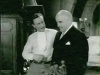
Now, I look at this picture and the first thing I notice is, what the hell is that around his neck? Looks like a pair of Fruit-of-the-Looms to me. There's the joke. [Some people] would take that joke and say "Hey what's with the underwear on his shirt?", which really isn't that funny at all. Now, a better beginning capper might have a better sense of style and cap something like "Hey Bob, you've got to try these new BVDs, they're so comfortable!" which is funnier but really puts the whole weight of the caption on the sight gag. It's the same joke, but *how* it's capped is totally different, the BVD line at least brings in the interaction of the two characters and makes you wonder what kind of nut this guy is that he doesn't know how to wear a pair of underwear. And yet he's oblivious enough that he'd actually recommend them to a friend. That makes it funny, it enriches the original joke. But it can still be taken beyond that, enriched further. In my cap (which I just pulled randomly from my gallery for the sake of illustration) I don't want the whole cap to hinge on the sight gag, so I ask myself why this guy might find himself in this situation. It's funny to have a guy who doesn't know how to wear a pair of underwear, but to me it's even funnier that he's a normal guy like you or me (okay, maybe not normal) but he's so nervous he somehow got screwed up while getting dressed and mixed up his briefs and his necktie. He's got this big sale to pitch to this rich and powerful-looking guy, there's a lot riding on it, and he's got everything perfect. You look at the body language in the picture and it's obvious that he's confident, he's getting friendly with the rich guy and is moving in for the sale. But the rich guy looks nervous and slightly embarrassed. Why? You look at the salesman's face and you can see he's paused for a millisecond to think, and has suddenly realized he's wearing his underwear where his tie should be. Talk about the worst blunder possible, and it's gone far beyond the point of no return! So basically he's fucked, but then, when you expect his final thought to be "Shit, I blew it!", he hits upon an even more pressing point: If these are his underwear, where in the hell is his tie? So basically, the style that the cap is written in, the approach and the language, take one joke and spin it into three or four jokes simultaneously. And for me, this makes it much funnier than it would have been otherwise. It's not one of my best caps by far, but I think the approach and the attention-to-detail transforms a standard joke into a cap worth saving.
