Difference between revisions of "Talk:Logo Contest"
BitShifter (talk | contribs) |
|||
| (5 intermediate revisions by 3 users not shown) | |||
| Line 7: | Line 7: | ||
[[User:UpSky2|UpSky2]] 3:17, 1 June 2006 (UTC) | [[User:UpSky2|UpSky2]] 3:17, 1 June 2006 (UTC) | ||
| + | ::I think you didn't notice that another image is an honest-to-god scientist slicing into a Mr. Potato Head! (It was from a program intended to make science more accessible for kids) --[[User:Mr Grant|Mr Grant]] 22:53, 4 July 2006 (UTC) | ||
Hey, thanks for posting my logo thing on the Candidates page! I was having trouble getting it to display right. (Whoops!) BTW, GREAT work on this site, guys! You're awesome! :D | Hey, thanks for posting my logo thing on the Candidates page! I was having trouble getting it to display right. (Whoops!) BTW, GREAT work on this site, guys! You're awesome! :D | ||
| Line 32: | Line 33: | ||
I think the image I uploaded is from one of the DVD box sets. The eclipse was used to provide a contrasting dark background for the pale yellow "Mystery Science Theater 3000" text, which covered pretty much every inch of the dark area. I just airbrushed out the text. | I think the image I uploaded is from one of the DVD box sets. The eclipse was used to provide a contrasting dark background for the pale yellow "Mystery Science Theater 3000" text, which covered pretty much every inch of the dark area. I just airbrushed out the text. | ||
[[User:BitShifter|BitShifter]] 18:56, 3 June 2006 (UTC) | [[User:BitShifter|BitShifter]] 18:56, 3 June 2006 (UTC) | ||
| + | |||
| + | |||
| + | Well, ok then BitShifter. Anyway, with some helpful contributions from glitter, I've uploaded my candidate. --[[User:GersonK|GersonK]] 18:16, 4 June 2006 (UTC) | ||
| + | |||
| + | |||
| + | Yes, Gerson, your second animated-Gif-ized version is much like the ideal logo. However, the balance of grabs is OK already (must-includes IMHO: Shatner lying down, Coronet Film, Potatos, Mr.BN, guys in ties), if a trifle fast in switching. 25 % slower better? | ||
| + | <BR> | ||
| + | (Again IMHO, forget the globe thing, being too derivative (of either CT! or Wikimedia) is inappropriate - we cappers are all original <STRIKE>artists</STRIKE> jokers! though we follow each other's lead too.) | ||
| + | <BR> | ||
| + | The 'Cappers present' text could be clearer either in a different color (for more contrast than yellow-on-pinkish) or in a taller font <SMALL>(higher-than-wide letters)</SMALL>. ? at a guess. | ||
| + | <BR> | ||
| + | Also (criticize criticize) pink isn't quite our color... and more-animi-grab-less-curtains (i.e. area ratios in image). --[[User:UpSky2|UpSky2]] 18:51, 4 June 2006 (UTC) | ||
| + | |||
| + | |||
| + | # I don't think there is an ideal balance of grabs. The idea of rotating the grabs frequently also captures the spirit of capping better, IMHO. It'd be about an even balance of images from IS, CT, and the dome, probably with a few WCFF and the like tossed in if those webmasters want. And 9 images at any given time. | ||
| + | # I may slow it down by a bit. | ||
| + | # I don't see how the globe is any more derivative than my design. | ||
| + | # A taller font would require tinkering with the height, maybe going closer to the full 135 pixels. Which would also allow for a larger image, but may | ||
| + | <!-- Intrusive edit: you didn't finish your sentence. Remove as wished. UpSky2 --> | ||
| + | <FONT COLOR="red">...?Que'? !Habla Ingles, Sehor!</FONT> | ||
| + | <!-- end intrusive edit. God send you a joyful may :-P --> | ||
| + | # Pink's what I have a good image for, taken from [http://www.archive.org/details/DIA57 this ad that should be showing on IS once every few months]. Maybe I could filter it to something redder. But I do like the idea of the curtains themselves being capping fodder and they make it a little less derivative. | ||
| + | |||
| + | --[[User:GersonK|GersonK]] 19:22, 4 June 2006 (UTC) | ||
| + | |||
| + | |||
| + | On point 3.: Pink curtains instead of red and different text is enough to make your version both legally and aesthetically sufficiently non-derivative. --[[User:UpSky2|UpSky2]] 19:40, 4 June 2006 (UTC) | ||
| + | |||
| + | Hey, in case y'all haven't seen the other logo Discussion, I am putting forward the following: click [http://www.flickr.com/photos/knetwork/sets/72157594183899028/ here] --[[User:Mr Grant|Mr Grant]] 03:47, 4 July 2006 (UTC) | ||
Latest revision as of 22:53, 4 July 2006
This is a great idea! Arch 16:44, 25 May 2006 (UTC)
IMHO, MrGrant's image at Capper National Laboratory is about the best possible style, if not content, a logo could have: Capper Lab logo
An animated GIF that alternates fairly quickly is in the capping mode, esp. if surreally unrelated stuff is included (the appearance of Godzilla among the other more staid images in the Capper Lab example is a telling effect.)
UpSky2 3:17, 1 June 2006 (UTC)
- I think you didn't notice that another image is an honest-to-god scientist slicing into a Mr. Potato Head! (It was from a program intended to make science more accessible for kids) --Mr Grant 22:53, 4 July 2006 (UTC)
Hey, thanks for posting my logo thing on the Candidates page! I was having trouble getting it to display right. (Whoops!) BTW, GREAT work on this site, guys! You're awesome! :D --LadyBlackAdder 06:00, 1 June 2006 (UTC)
Because it just wouldn't be very interesting without graphics. (Sorry, had to do it.) What about something based roughly on an MST3K-esque design?
--Indomitus 12:03, 1 June 2006 (UTC)
You mean something like this Up?  Well, it may require more work to do it in my "rotate the image every day" fashion. --GersonK 14:17, 1 June 2006 (UTC)
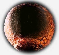
I threw up (retches) an idea for the logo using the MST3K-esque planet with some sort of rough font superposed. That might be an interesting idea, since the "globe" shape is similar to the actual standard Wiki logo
--BitShifter 16:17, 1 June 2006 (UTC)
I uploaded a blank MST3K-like planet for anyone who wants to experiment with different fonts. Of course, you'll have to resize any effort to below 135x135 before submitting a candidate...
 BitShifter 20:43, 1 June 2006 (UTC)
Another draft:  This is pretty close to what I think the final version will look like (though the final version would have more randomly selected grabs). I'm still waiting for some sample images from glitter, and if anybody has thoughts on how to make the "Cappers Present" text a little sharper, I'd be greatful.
Both of the other candidates look pretty nice, too, though you guys may want to consider making the backgrounds transparent. BitShifter - my only other comment is that the eclipse on the planet surface is sort of distracting. Maybe something like this?
  .
--GersonK 16:55, 3 June 2006 (UTC)
I think the image I uploaded is from one of the DVD box sets. The eclipse was used to provide a contrasting dark background for the pale yellow "Mystery Science Theater 3000" text, which covered pretty much every inch of the dark area. I just airbrushed out the text. BitShifter 18:56, 3 June 2006 (UTC)
Well, ok then BitShifter. Anyway, with some helpful contributions from glitter, I've uploaded my candidate. --GersonK 18:16, 4 June 2006 (UTC)
Yes, Gerson, your second animated-Gif-ized version is much like the ideal logo. However, the balance of grabs is OK already (must-includes IMHO: Shatner lying down, Coronet Film, Potatos, Mr.BN, guys in ties), if a trifle fast in switching. 25 % slower better?
(Again IMHO, forget the globe thing, being too derivative (of either CT! or Wikimedia) is inappropriate - we cappers are all original artists jokers! though we follow each other's lead too.)
The 'Cappers present' text could be clearer either in a different color (for more contrast than yellow-on-pinkish) or in a taller font (higher-than-wide letters). ? at a guess.
Also (criticize criticize) pink isn't quite our color... and more-animi-grab-less-curtains (i.e. area ratios in image). --UpSky2 18:51, 4 June 2006 (UTC)
- I don't think there is an ideal balance of grabs. The idea of rotating the grabs frequently also captures the spirit of capping better, IMHO. It'd be about an even balance of images from IS, CT, and the dome, probably with a few WCFF and the like tossed in if those webmasters want. And 9 images at any given time.
- I may slow it down by a bit.
- I don't see how the globe is any more derivative than my design.
- A taller font would require tinkering with the height, maybe going closer to the full 135 pixels. Which would also allow for a larger image, but may
...?Que'? !Habla Ingles, Sehor!
- Pink's what I have a good image for, taken from this ad that should be showing on IS once every few months. Maybe I could filter it to something redder. But I do like the idea of the curtains themselves being capping fodder and they make it a little less derivative.
--GersonK 19:22, 4 June 2006 (UTC)
On point 3.: Pink curtains instead of red and different text is enough to make your version both legally and aesthetically sufficiently non-derivative. --UpSky2 19:40, 4 June 2006 (UTC)
Hey, in case y'all haven't seen the other logo Discussion, I am putting forward the following: click here --Mr Grant 03:47, 4 July 2006 (UTC)