Difference between revisions of "Talk:Logo Contest"
m |
BitShifter (talk | contribs) |
||
| Line 29: | Line 29: | ||
Both of the other candidates look pretty nice, too, though you guys may want to consider making the backgrounds transparent. BitShifter - my only other comment is that the eclipse on the planet surface is sort of distracting. Maybe something like this? [[Image:Planet.gif]]. | Both of the other candidates look pretty nice, too, though you guys may want to consider making the backgrounds transparent. BitShifter - my only other comment is that the eclipse on the planet surface is sort of distracting. Maybe something like this? [[Image:Planet.gif]]. | ||
--[[User:GersonK|GersonK]] 16:55, 3 June 2006 (UTC) | --[[User:GersonK|GersonK]] 16:55, 3 June 2006 (UTC) | ||
| + | |||
| + | I think the image I uploaded is from one of the DVD box sets. The eclipse was used to provide a contrasting dark background for the pale yellow "Mystery Science Theater 3000" text, which covered pretty much every inch of the dark area. I just airbrushed out the text. | ||
| + | [[User:BitShifter|BitShifter]] 18:56, 3 June 2006 (UTC) | ||
Revision as of 18:56, 3 June 2006
This is a great idea! Arch 16:44, 25 May 2006 (UTC)
IMHO, MrGrant's image at Capper National Laboratory is about the best possible style, if not content, a logo could have: Capper Lab logo
An animated GIF that alternates fairly quickly is in the capping mode, esp. if surreally unrelated stuff is included (the appearance of Godzilla among the other more staid images in the Capper Lab example is a telling effect.)
UpSky2 3:17, 1 June 2006 (UTC)
Hey, thanks for posting my logo thing on the Candidates page! I was having trouble getting it to display right. (Whoops!) BTW, GREAT work on this site, guys! You're awesome! :D
--LadyBlackAdder 06:00, 1 June 2006 (UTC)
Because it just wouldn't be very interesting without graphics. (Sorry, had to do it.) What about something based roughly on an MST3K-esque design?
--Indomitus 12:03, 1 June 2006 (UTC)
You mean something like this Up?  Well, it may require more work to do it in my "rotate the image every day" fashion. --GersonK 14:17, 1 June 2006 (UTC)
I threw up (retches) an idea for the logo using the MST3K-esque planet with some sort of rough font superposed. That might be an interesting idea, since the "globe" shape is similar to the actual standard Wiki logo
--BitShifter 16:17, 1 June 2006 (UTC)
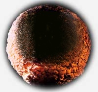
I uploaded a blank MST3K-like planet for anyone who wants to experiment with different fonts. Of course, you'll have to resize any effort to below 135x135 before submitting a candidate...
 BitShifter 20:43, 1 June 2006 (UTC)
Another draft:  This is pretty close to what I think the final version will look like (though the final version would have more randomly selected grabs). I'm still waiting for some sample images from glitter, and if anybody has thoughts on how to make the "Cappers Present" text a little sharper, I'd be greatful.
Both of the other candidates look pretty nice, too, though you guys may want to consider making the backgrounds transparent. BitShifter - my only other comment is that the eclipse on the planet surface is sort of distracting. Maybe something like this?
  .
--GersonK 16:55, 3 June 2006 (UTC)
I think the image I uploaded is from one of the DVD box sets. The eclipse was used to provide a contrasting dark background for the pale yellow "Mystery Science Theater 3000" text, which covered pretty much every inch of the dark area. I just airbrushed out the text. BitShifter 18:56, 3 June 2006 (UTC)